In the past few months I have a read a few graphic novels, and I will quickly review them all here. It’s Spring Cleaning Super-Sized!
The first title is a compilation of info graphics about graphic novels entitled, Super Graphic: A Visual Guide to the Comic Book Universe by Tim Leong. Some of the infographics are specific to a certain series and others are more general. For example, you can see a graphic depiction of the the Marvel Universe, a history of Manga in visual form, or a graph charting the sadness scale of Chris Ware all in one book. It is a fun and novel way to look at the world of comics and is the perfect read for fans of any graphic novels and comics as well as a great choice for librarians who want to learn more about the history of the format.
This is a book best digested in pieces, not all at once. I was fasciated by the infographics every time I cracked the book open, but they were each chocked full of so much information that after reading a few, my head was spinning and I needed a break. But then, when I returned back to the book, I was again enthralled for awhile. This was a constant cyle for me.
This book was especially enjoyable because I had spent much of 2013 engaged in the ARRT Graphic Novel Genre Study. Super Graphics felt like a combination recap/pop quiz.
I highly suggest this book for anyone who works with comics and graphic novel readers. Since the scope here is huge, no one is enough of an expert in every area of every type of graphic novel to not find something new and/or interesting here.
Three Words That Describe This Book: fascinating, huge scope, intensely visual
Readalikes: This is easy. I suggest you take a look at
Super Graphics and try NOT to find a suggestion for further reading.
But for people more interested in Infographics than the comics world, try
The Best American Infographics series, edited by Gareth Cook and now in its second year.
Much like my review earlier in the week on
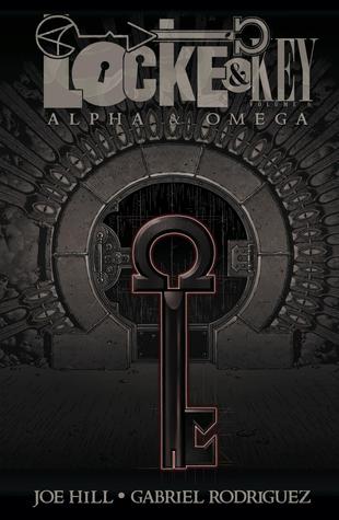
the 6th book in the Flavia de Luce series, I also recently read the 6th, but in this case FINAL, installment in my absolute favorite horror series by Joe Hill and Gabriel Rodriguez,
Locke and Key. The final compilation is titled
Alpha & Omega.
The Locke and Key story can be recapped in full by looking at my reviews of the first five volumes
here.
I will say that this final compendium of the last 6 individual comics brings the story to a satisfying conclusion for horror fans. Joe Hill, always willing to work within the constraints of the horror genre while at the same time actively pushing its boundaries [see
Horns and
NOS4A2 for example]. The result here is the PERFECT horror ending.
There is an uneasy build to the fast approaching the final battle...on PROM night! Remember our main characters are teenagers here, plus that allows Hill to throw in a funny, and not too subtle,
Carrie reference. While most of the good guys ultimately triumph over the bad guys Hill leaves a VERY SUBTLE hint of the evil still lurking within the Locke family. In fact, I went back to give the panel another look. It is before the final battle, but it very clearly sets up great feelings of unease. While it appears the Locke’s have won, the reader still has an uneasy feeling that it could all repeat for yet another generation. Well done Hill. And just like with
NOS4A2, if you are not a careful reader, you may miss it, and missing it changes the entire tone of either work. Just when horror fans think they have seen it all, Hill is still able to put a small twist into the story.
As Hill promised, the conclusion to the multi-generational battle here does not end without some tears, but overall, the family is in a better place than they were when
the series began. most importantly, Tyler is able to work to the unresolved issues he had with his dad who was murdered as the first book opened.
I have been proclaiming for years, that Locke and Key was not only the best graphic novel series out there, but also the best horror series available. Now that it has completed its run, I am gad to see I was not proven wrong.
Three Words That Describe This Book: compelling, unsettling, complex characters.
Readalikes: Again, I have many options listed
here, but with the Locke and Key saga coming to an end, I need to find a new dark graphic novel series to be obsessed with.
Last year I found two newer series to love and I think they share enough with Locke and Key to be solid readalike suggestions. Use the links provided for details.
- Revival by Tim Seeley and illustrated by Mike Norton
- Saga by Brian K. Vaughan and Fiona Staples
And now from supernatural horror, to real life horror,
The Great War: July 1, 1916: the First Day of the Battle of the Somme by Joe Sacco.
From the publisher:
Launched on July 1, 1916, the Battle of the Somme has come to epitomize the madness of the First World War. Almost 20,000 British soldiers were killed and another 40,000 were wounded that first day, and there were more than one million casualties by the time the offensive halted. In The Great War, acclaimed cartoon journalist Joe Sacco depicts the events of that day in an extraordinary, 24-foot- long panorama: from General Douglas Haig and the massive artillery positions behind the trench lines to the legions of soldiers going “over the top” and getting cut down in no-man’s-land, to the tens of thousands of wounded soldiers retreating and the dead being buried en masse. Printed on fine accordion-fold paper and packaged in a deluxe slipcase with a 16-page booklet, The Great War is a landmark in Sacco’s illustrious career and allows us to see the War to End All Wars as we’ve never seen it before.
As described above, this item is made up of 2 distinct parts. Both pieces slide into a sturdy cardboard sleeve. We have been circulating this item with no problems as of yet. I included the above photo rather than the traditional cover so that you could see what this work looks like.
Sacco has drawn a panorama of the first 24 hours of WWI’s epic Battle of the Somme, using 1 foot to depict each hour. This graphic novel is one giant picture, drawn in great details using only black, white, and shades of grey. The detail is amazing, moving, heartbreaking, and educational. In the 16 page booklet, Sacco has an artist’s note where he explains why and how he created this book, while journalist and historian Adam Hochschild wrote a succinct and educational essay on the Battle itself, placing the graphic novel in a larger perspective.
If you are unfamiliar with Sacco’s previous work, let me fill you in quickly by explaining that he is the undisputed king of modern war comics. He is a graphic journalist. His most complete and best work is
Palestine, which won the American Book Award and started an entirely new form of journalism.
Since 2014 is the 100 year Anniversary of the start of WWI, many books are coming out on the topic, but I would venture that none will be as heart wrenching and moving as this one. The pictures are deceptively simple, but taken together en mass, reading this is an overwhelming experience. Seeing soldiers injured and killed, bombs exploding, life in the trenches, all of this only in simple black and white strokes is somehow worse than if it was in full technicolor. While large moments like troops charging, and entire regiments preparing are clear, it was in the smaller moments, drawn with loving detail that got me. A single solider, back to the reader, reliving himself against a building; men sitting around a camp fire; a single bandaged solider waiting for medical attention. If you had no opinion of feelings about WWI before now, read this book and you will begin to grasp the horror of the Great War.
Three Words That Describe This Book: heartbreaking, informative, thought provoking
Readalikes: There are a few ways to go here.
Click here for a list of the most popular books tagged World War I on Goodreads. I like the sampling there.
If you want to read about the Battle of the Somme in prose, try the extremely well received
The First of July by Elizabeth Speller which came out right at the end of 2013.
Finally for more graphic journalists try:


